‘Typography as image’ gets results on trailside signs
LAWRENCE — Stewards of parks and wild lands would do well to understand the term “typography as image” and to employ it in practice, according to the results of a new study of how trailside signs influence users’ behavior.
The design strategy combines the two qualities most desired by those who wish to send messages like “leash your dog” or “wipe your feet to prevent invasive plants spreading” – it grabs the attention, which then gives the communicator a chance to provide more information to answer the “why” question in related text and images.
These qualities of “attention capture” and “elaboration” were among the factors considered in a new paper to be published in the June edition of the Journal of Outdoor Recreation and Tourism. A pre-publication copy of the paper went online in January.
The article, titled “The impact of graphic design on attention capture and behavior among outdoor recreationists: Results from an exploratory persuasive signage experiment,” was co-written by Jeremy Shellhorn, University of Kansas associate professor of design, and William Rice, assistant professor of outdoor recreation and wildland management at the University of Montana. Eighteen of their students helped carry out the experiment over summer 2022.
The paper stems from Shellhorn’s Design Outside Studio, in which he takes students camping each summer to execute some project that will benefit the public while offering the students hands-on training.
Shellhorn said Rice learned about Design Outside and contacted him to suggest a collaboration.
“He said, ‘I'd love to take what you guys do visually and join it with what my students put together in terms of strategic messaging.’ So we bounced ideas back and forth,” Shellhorn said. “For this particular class, we wanted to do a shorter, four-week project as a proof of concept on how graphic design students and outdoor recreation and park management students might collaborate together.”
Rice’s Montana students had previously worked with the Missoula Parks and Recreation Department, Shellhorn said, and knew what “resource issues” they faced, including invasive plants spreading and dogs wandering unleashed on recreational trails.
“They came up with some positive messaging around it and then presented those messages to my class on Zoom,” Shellhorn said. “And then we came up with visual ways that we thought could express those, using proven graphic design principles.”
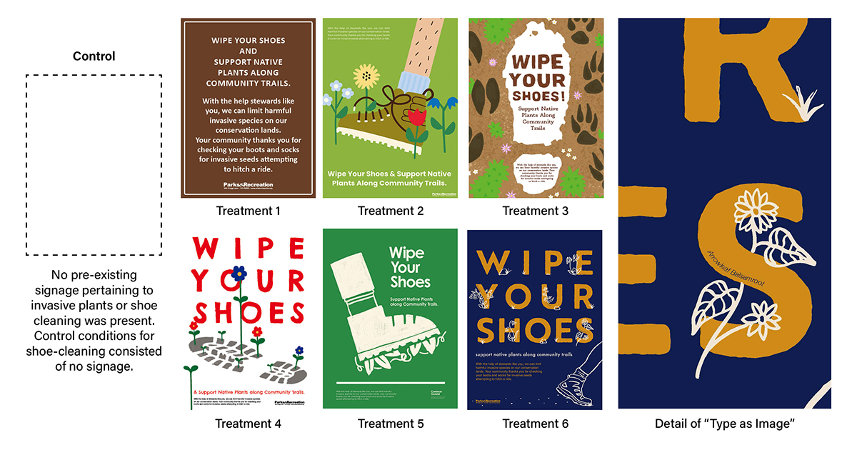
For each of the two messages – concerning dogs and plants – the designers came up with six different signs to compare how they worked. They built semi-permanent frames with a slot for posters, then rotated through the designs and observed how trail users responded. The plant-related sign also had an adjoining boot-scraping brush, which hikers/readers were urged to use.
Shellhorn said it was a challenge to meet the park rangers’ communicative expectations.
“People are going to these places to not be inundated with messaging,” he said. “So you have to find that balance wanting to prompt them, but also not to belabor it. ... What typeface is it, and how big is it? What kind of imagery reinforces it or subverts it... to get somebody to pay attention, to essentially engage with this?
“That was a fun thing to bring into the classroom and challenge the students. We could all put the sign up and look at it from a distance and see, ‘Is there a takeaway from 20 feet away, if you don't want to read the fine type? And how much is somebody willing to read, in this case?’
“At that point, the students are doing it for the project. They're not doing it for me anymore. It's not me saying, ‘It's not working.’ It's just not working.”
In each case of dog and plant messaging, Shellhorn said, the best results — by a significant margin — were gleaned from a “typography as image” approach.
“It’s a good strategy because people are reading the words, but they're also reading the image at the same time,” he said. “If you can get somebody to read something in a certain context, it makes the messaging happen faster. If I have to look at a picture, and then I have to read the text, that's two things that I have to read. But if I can read them simultaneously — if I can make a word look like a dog’s leash, or like it's made out of native plants — then, all of a sudden, you don't have to say ‘native plants’ in the text. You can say something else in the text.
“That strategy works really well when you're trying to get a quicker read on a poster or a trailhead sign — where somebody's going to read it while they're moving or where there's a lot of other activity going on, and you're trying to capture their attention.”
Furthermore, he said, “If you've gotten them to read that first one, and it's done in a creative or interesting way, then you're more likely to get them to get to the elaboration.”
Image: The new paper compares the results obtained by six different trailside signs. Credit: Courtesy Jeremy Shellhorn