National Park Service signs inspire a new typeface
LAWRENCE – Nearly a quarter-million people volunteer each year to work for the National Park Service. That’s a lot of trash pickup and trail blazing.
But University of Kansas researcher Jeremy Shellhorn, his colleagues and students have just donated work of a very different sort: a new typeface inspired by the iconic, wooden wayfinding signs of the Park Service.
Inspired by the bureau's communal ethic, Shellhorn and friends have made their font – which is named “National Park Typeface” – open-source, meaning it is free to download.
Shellhorn, associate professor of design, is an avid outdoorsman who has cultivated relationships with rangers at Colorado’s Rocky Mountain National Park and representatives of the nearby outdoor-gear industry. For the past four years, Shellhorn’s students have worked on a project in the park, including creating signage for a section of the Alpine Ridge Trail and redesigning the park’s newspaper.
“I have traveled to that park numerous times with my family,” Shellhorn said. “One time I got the park newspaper, and I saw some of the information graphics on the waysides or in some of the visitor centers, and I was like, ‘Wow, the national parks are an amazing part of America, and why isn't the design work as good as the work that the people do here?’ There are reasons for that. They just don't have the resources to put in.
“I've always felt that, as an educator, I have the privilege to work on projects that other people might not be able to. So I just cold-called them out of the blue and said, ‘Would you guys like any design help?’ knowing that I could provide skills, but also that I wanted eventually to get my students plugged in.”
The park superintendent connected Shellhorn with the chief of interpretation and education, and they were off and running. But that streak might be broken this year because the parks are closed by the federal government shutdown – although Shellhorn has a related project for his spring 2019 students.
The story of the font, though, starts with a personal trip Shellhorn took to the Rocky Mountain National Park a few years ago. It was then he began to notice and think about the letters carved into wooden park signs.
“Those signs are really iconic,” Shellhorn said. “I think anybody that's ever been to a national park … you've seen a wooden sign. The letters always look the same, and those letters are the results of using a router (i.e., a drill) to cut them out of wood. So I asked the rangers, ‘What typeface is that?’ and they said they didn't know.
“So then they put me in touch with the sign shop at Rocky Mountain National Park … and they said, ‘Well, it's not actually a typeface.’ It's these certain paths that … when we put a router bit to it, it makes the typeface.”
Perhaps in olden days, Shellhorn said, the letters were created with stencils. Today, however, the Park Service uses a digitally programmed router to create its wooden signage.
“And so it never actually exists,” Shellhorn said. “It only becomes that typeface when the router bit hits the wood.”
Shellhorn said he was discussing the issue with Ranger Miles Barger, “and I said ‘What's going to happen if they stop using a router?’ because they're starting to print everything digitally, and they weren't sure. So I said, ‘It would be great to have a digital version of this typeface.’ That way, no matter what technology they use to make these signs, it would still have that iconic typeface that matches all the old signs.”
Shellhorn consulted with his colleague, Associate Professor of Design Andrea Herstowski, then started the project. Eventually, he brought in two now-former students, Chloe Hubler and Jenny O’Grady, to help.
He started with the computer file that directs the drill, or router, in making Park Service signage letters.
“We drew it first, and then we digitized it, and then we put it in a typeface software called Glyphs, and now it's a typeface anybody can download and anybody can use it — just like just like the parks,” Shellhorn said. The set includes uppercase and lowercase letters, and numbers 0-9.
Downloadable files, plus the background story on the font, reside on a website Shellhorn created.
“People from all over the world have been downloading it,” Shellhorn said. “It was something fun for me, and the students got a great experience because they got to contribute to the national parks. They got to give the rangers something that the rangers wouldn't have otherwise had the expertise to do.”
As for the public, Shellhorn said, they get a free gift, too.
“You want people to look at it and be like, ‘Oh, my gosh! That's the typeface I saw when I went on a camping trip with my family,’ or, ‘That's the sign that I've seen a million times when I went to a national park on a road trip in college,’” he said.
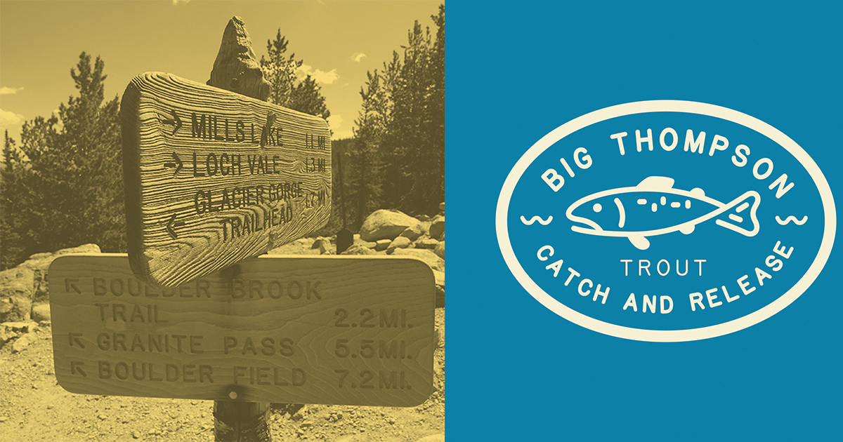
Photo: Actual Rocky Mountain National Park wooden signs (left, above) and a design made with the new National Park Typeface.